Health Care Quality-Spending Interactive
{{error.title}}
The United States spends far more on health care than other wealthy nations, but that investment does not achieve better quality of care or improved health outcomes. Furthermore, both spending and quality vary widely across, and even within, states. In this tool, we provide ways for you to compare health care spending, relative to quality of care, in all states, as well as in the nation’s 300-plus local health care markets, called hospital referral regions (HRRs).
These data will help you make comparisons, both between regions and among two key populations: Medicare patients and working-age adults (ages 18–64) with employer-sponsored health insurance. We offer a number of features to help you synthesize these findings into your work, including:
- The ability to choose quality measures and view these data by state or by local health care markets within a state, and then see how a state is faring compared to others
- The ability to easily take a screenshot of your customized graph, in order to integrate it into your reports and presentations, or to send out via social media
- Some resources to give you ideas on how you can take action.
Loading Interactive


{{costIndicator.name}} vs. {{qualityIndicator.name}}
{{selectedComparison.name}}
in {{selectedHrrFilterState.geoname}}
| Quality: | |
|---|---|
| Spending: |
What Am I Seeing in This Graph?
This graph offers data on the two key populations — Medicare patients and working-age adults (ages 18–64) with employer-sponsored health insurance — in one view. When the circles are farther apart, there are larger differences in quality of care, or per-enrollee spending, between Medicare patients and working-age adults with job-based health insurance (and, therefore, smaller differences when the circles are closer together).
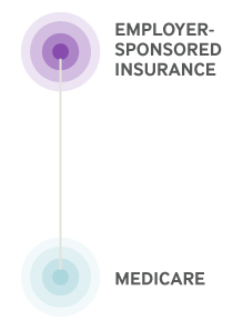
To make comparisons easier, these data, too, are plotted relative to the median for the United States for each population. A given state may perform, say, 20 percent worse than the U.S. median for working-age adults with employer-sponsored insurance on a given metric (e.g., avoidable emergency department visits), but 75 percent better than the U.S. median for its Medicare enrollees on that same measure. You can click on a state circle to display data for the local areas within that state.
You also can sort these data in a number of ways: alphabetically by state or hospital referral region; ranked from best to worst compared to the U.S. median on Medicare; and then the same ranking for employer-sponsored insurance.
What does it mean?
While the two populations — older adults with Medicare and nonelderly adults with insurance through an employer — have different characteristics and needs, direct comparisons can offer some insights about the ways insurance coverage and organization of the health care system shape quality and spending. For example, in most states both Medicare beneficiaries and employer-insured adults use emergency departments for nonemergency care at similar rates. This could suggest that factors other than coverage or age, such as inadequate access to primary care, may be driving the behavior.
Looking at the graphs for both populations makes clear that in most states and local areas, there is little consistency between per-enrollee spending by Medicare and by employer-sponsored plans. If there is a pattern, it’s that most areas tend to have high spending for one group with low spending for the other.
One key reason for the disconnect between spending by Medicare and by employer-based plans is that Medicare prices are, for the most part, set by the fee schedule used by Medicare to reimburse doctors and other providers, while prices paid by employer-based plans (which are usually higher) are set by insurers negotiating with providers. As a result, the prices paid by private insurers can vary — even for the same service performed by same provider in the same year. In addition, some market areas also have limited competition among providers, which means the providers can insist on higher prices.
We hope you will use the Health Care Quality–Spending Interactive to uncover patterns or questions that might ultimately shed more light on how best to improve the value of health care in the United States, and that you’ll share what you learn.
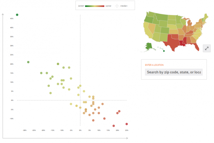
What Am I Seeing in This Graph?
This graph, called a scatter plot, blends together two measures, one related to spending and the other to quality. These data are plotted relative to the median for the United States. Quality is measured along the vertical axis (y-axis) and spending per person is measured along the horizontal axis (x-axis).
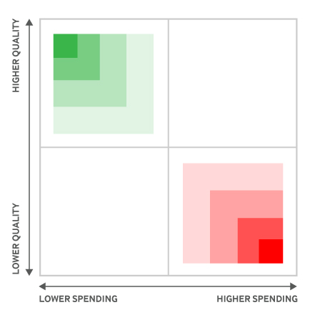
Location matters greatly on this graph. States or local areas located in the upper-left quadrant of the scatter plot — shaded green — spend less and achieve higher quality,. Those in the lower-right quadrant — shaded red — spend more, yet achieve lower quality. You can also click on the arrows next to the U.S. map for a geographical view of the same data.
Quality score values may appear in horizontal groups because of rounding.
Spending Indicator Source: Data Year: {{costIndicator.timeFrame}} - {{costIndicator.source}}
Spending Indicator Notes: {{costIndicator.notes}}
Quality Indicator Source: Data Year: {{qualityIndicator.timeFrame}} - {{qualityIndicator.source}}
Quality Indicator Source: {{qualityIndicator.notes}}